
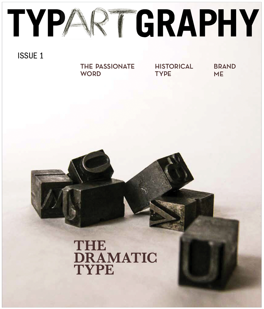
TYPE

This publication was originally created in 2015 as a Type project. The Main theme is that Type is Art and Art is Type. Melding the two as one was a natural progression. This is the first issue. New issues to come. Design by Jade DaRu. Co-written by Jade DaRu and Scott C. Sickles


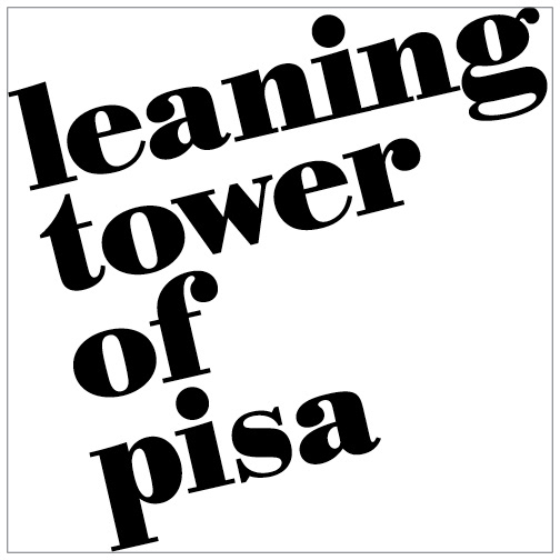
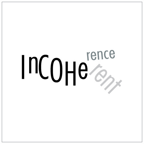
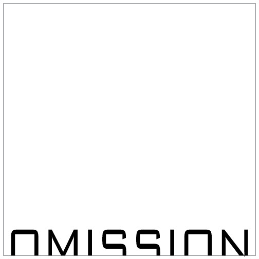
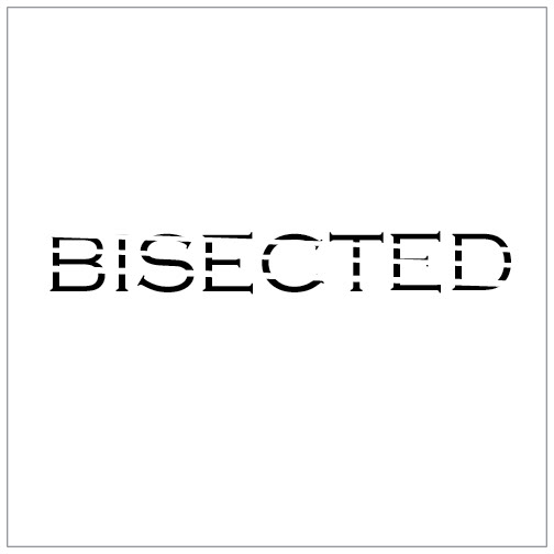
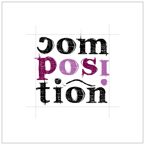
A word or phrase described typographically.
Each word was done by hand with ink and paper first, then it went digital.
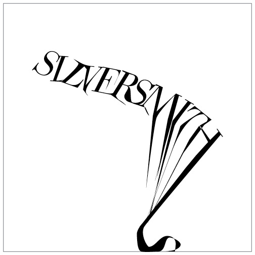
Melted
Extra black, extra thin
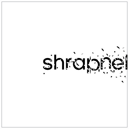
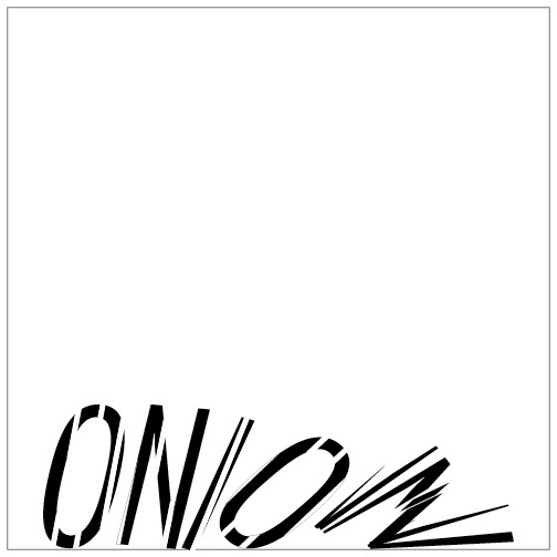
Explosion I
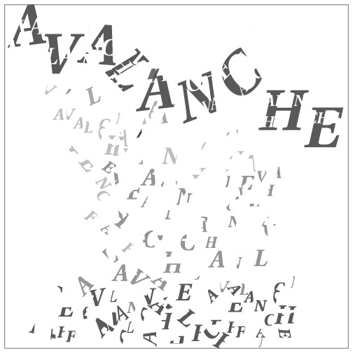
Explosion II
Earthquake
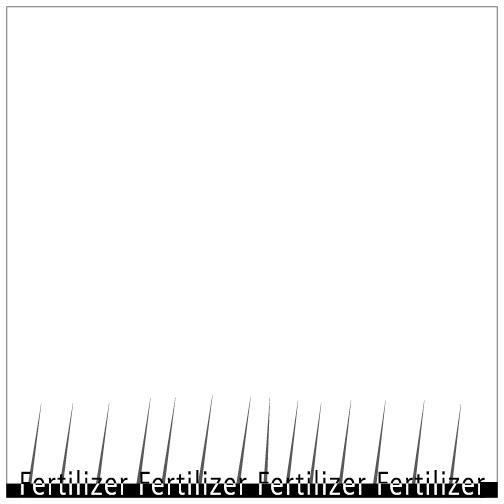
Dissolve into ground
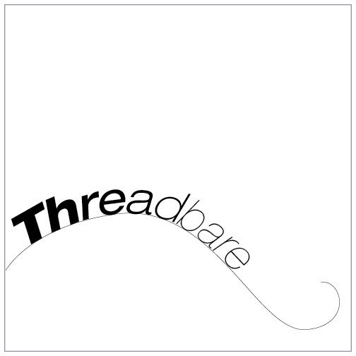
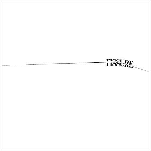
Slice
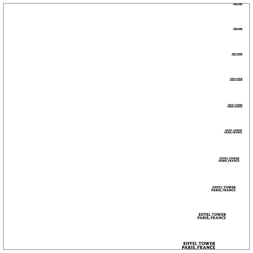
Flush right, uppercase letters, too small
Flush left, lowercase letters, too large
Disjointed
Half-missing
Mutilated
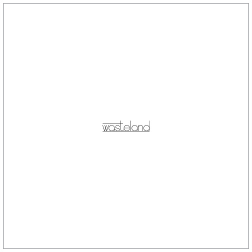
Empty
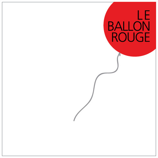
Black letters, red background
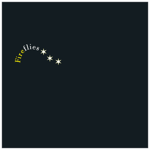
Yellow & white type, black background
Painted letterform
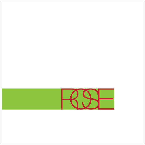
Red overlapping type, green background
JERRY LESS, Playwright & Director
Originally this project was to design the playbill for a staged reading of William Shakespeare's Henry VI Trilogy, entitled Game of Roses. The logo had already been created for the title, however, a logo needed to be designed for Mr. Less's theater production company, NY Heartbeat Theater.
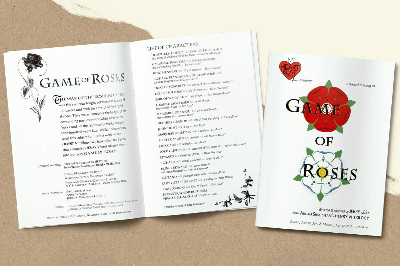
Game of Roses Playbill
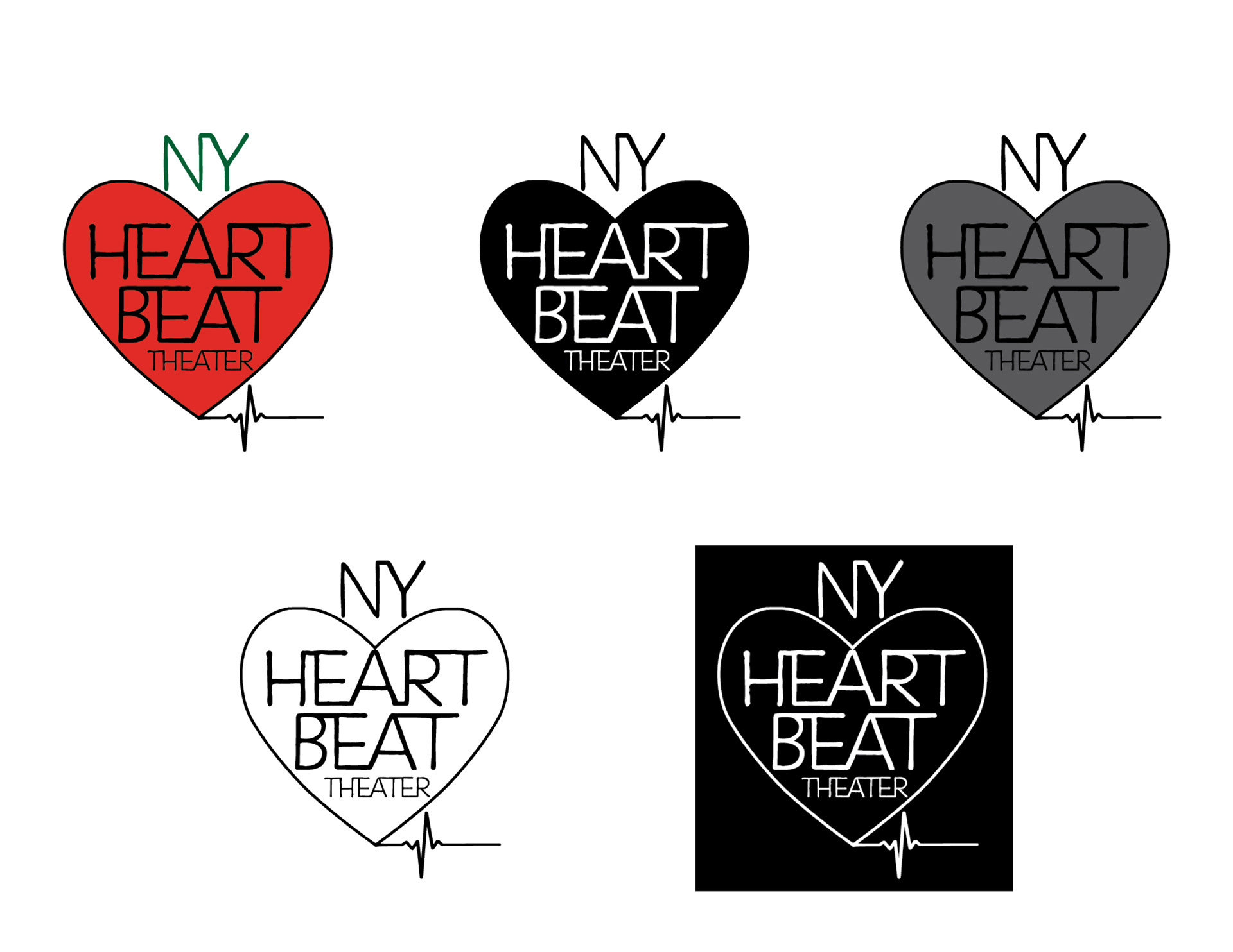
NY Heartbeat Theater Logo